Purpose: To provide consistency to the style and format of the documents in order to published on SICODI. Offering a set of standards for the writing and design of the documents.
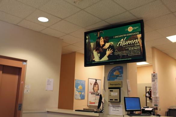
Content: The banners that will be published on the screens must contain information related to activities arranged by the University of Jaén, in other words, in which the universitary institution appears as an organizing entity, collaborator or participant. The University of Jaén logo must appear on the posters. In this sense, it must respect the corporate visual identity of the UJA, for which you can check the Corporate Visual Identity Manual, which can be found on the website: https://www.uja.es/gobierno/viccom/identidad-corporativa
Any activity outside the UJA will not be published.
At the time of the elections, whatever is authorized by the Board of Elections shall be published.
Format: It must be taken into consideration that the screens are horizontal, so it will be necessary to adapt the banners to this format for proper viewing.
The recommended resolutions are:
- 1920x1080, 1366x768,
- Try not to downgrade from VGA resolutions (640x480) and in case that the files have more pixels than the recommended, downgrade the resolution with any software in the market.
Scala software supports the following file formats:
- Graphic: BMP, GIF, IFF, JPEG(RGB), PCX, PNG, Targa, TIFF, WMF
- Animation: FLI, AnimGIF, Flash(SWF)
- Video: MPEG1, MPEG2, H.264 MPEG4 Part10, WMV, AVI, Open QuickTime 3 or earlier. (The inclusion of a video must be studied previously by the Communication Secretariat of the UJA)
- NOTE: MainConcept MPEG2 and H.264 CODECs are provided with Scala 5. QuickTime 4 and higher is not officially supported.
- Streaming: Windows Media Streaming. HTTP// or MMS//. WMV, ASX, or ASF. Starting with Release 6 MPEG2 program / transport and H.264 transport streams are supported over RTSP/RTP.
- Sound: WAV, MP3, WMA (Currently, the screens do not have installed an option for sound)
Style: Texts must remain short. As the difficulty to read it increases depending on the text's length. The information must contain at least: type of activity, name, days, when and where will it take place.
The minimum size for the letters of the body must be equal to 20. It is important to remain it short, but still straightforward. In this case, it is better to do one or more posters, so they appear one after the other on the screens.
Basic data for the posters (Available examples of some posters at the Annex)
- Type of the activity
- Title
- Lecturer
- Day
- Hour
- Place
- Logos of organizers and collaborators (to dispense with a few without being many)
It is a must to use a non-sexist language. For example: students, teachers, researchers / research staff / scientific staff.
If previously designed posters are sent in portrait format, they must be adapted to landscape format for correct display.
The recommendation is that the design should be simple. Do not saturate the screen with elements that do not provide information, they must be ordered and consistent on each page, according to the guidelines mentioned.
Typography: It is advisable to use fonts that are available and visible on all computers and devices. This type of fonts are called system fonts, because they come pre-installed when you buy a computer. If system fonts are not used, the readability of the page will be compromised; when a browser does not find the font it replaces it with the one it has predefined. Among these sources, to publish content on screen is recommended to use the types of dry stick, ie, which have no auctions, such as Arial or Verdana, which are faster to read.
Color: The use of color has a high impact on the legibility and perception of the page by the user. The use of cold and unsaturated colors is recommended for backgrounds and dark colors for texts, thus ensuring that there is always enough contrast for the user to read the text comfortably. We must avoid dark backgrounds, with repeated frames or with photos. The cleaner it is, the easier it will be read.
RECOMMENDATIONS
A simple and minimilastic poster is better than one full of images and text, which prevent attention from being focused on what is important. (It must be borne in mind that a design for printing on paper -postel, leaflet, diptych, etcetera, which is seen up close, is not the same as a design for viewing on a screen, farther away from the field of vision. For this reason, the same design will not always work for both.
Send your request to sicodi [arroba] ujaen [punto] es (sicodi[at]ujaen[dot]es)